Home Creators Posts Import Register Favorites Logout
haven't archived this post yet. have a subscription? use the importer!

Content

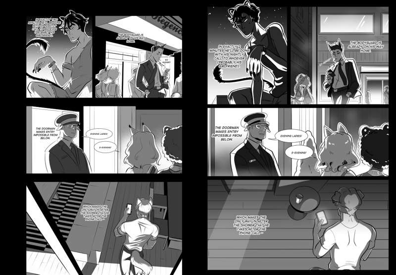
spent all morning redoing this page to play about with the style but tell me why i prefer some aspects of the old one (on the right) more lmao. The old first panel pose with Sith is more dynamic definitely.

Files

Previews only

Comments

Cy

I like the heavy shadows on the first panel in the old one, vs the softer lighting in the final panel. The other panels are definitely better in the new one - I think the rim lighting in the old panels 2 and 3 are a bit excessive. HOWEVER also think the lighting in the new final panel is a bit too stark. I said I liked the heavy, stark shadows in the old panel 1, because it suits the noir vibe you seem to be going for, but stark contrasts and heavy shadows work best if used sparingly, and complimented with softer lit panels. If every panel is dramatic, no panel will be dramatic, if that makes sense.

Cy

Oh also! Since you’re doing style tests - consider squishing the sides of your bubbles, so they aren’t regular ellipses. Mesh transformation tool on CSP and I believe Warp on Photoshop. It’s a teeny thing that instantly makes them look a lot more polished :)

Lilith S.

yeah the old first panel really makes the character feel like a cat as well

Megan Grey

goooood shout, fitting those round bubbles in panels is such a pain sometimes, thanks for reminding me i can just change them lmaoo